Color Psychology in Brand Design
Harnessing the power of color psychology in branding
In the world of branding, every color choice is a calculated decision that transcends mere aesthetics. The utilization of color psychology is a strategic tool that holds the potential to affect people’s emotions and perceptions of your brand. This article delves into the power of and meanings behind various colors, and illustrates how to harness them effectively for brand recognition and creating a lasting impact.
Colors alone can influence a first impression of up to
90%
What is Color Psychology
Color psychology is the study of how colors can influence human behavior, emotions, and perceptions. It explores the psychological effects that different colors can have on individuals and aims to understand the ways in which color choices can impact moods, attitudes, and decision-making. While color theory helps in understanding the nature of colors and creating harmonic color combinations, color psychology dives into the emotions behind colors.
The premise of color psychology is rooted in the idea that colors have inherent associations and can evoke specific emotional responses or reactions. These associations can be influenced by cultural, societal, and personal factors. For example, red might be associated with passion and energy in one culture, while it could symbolize danger or caution in another.
Color psychology can be applied strategically in brand design, and is used to impact how people perceive different brands. That’s why it’s crucial to pick a color palette that aligns with your business’s goals and target audience.
Understanding Color Psychology
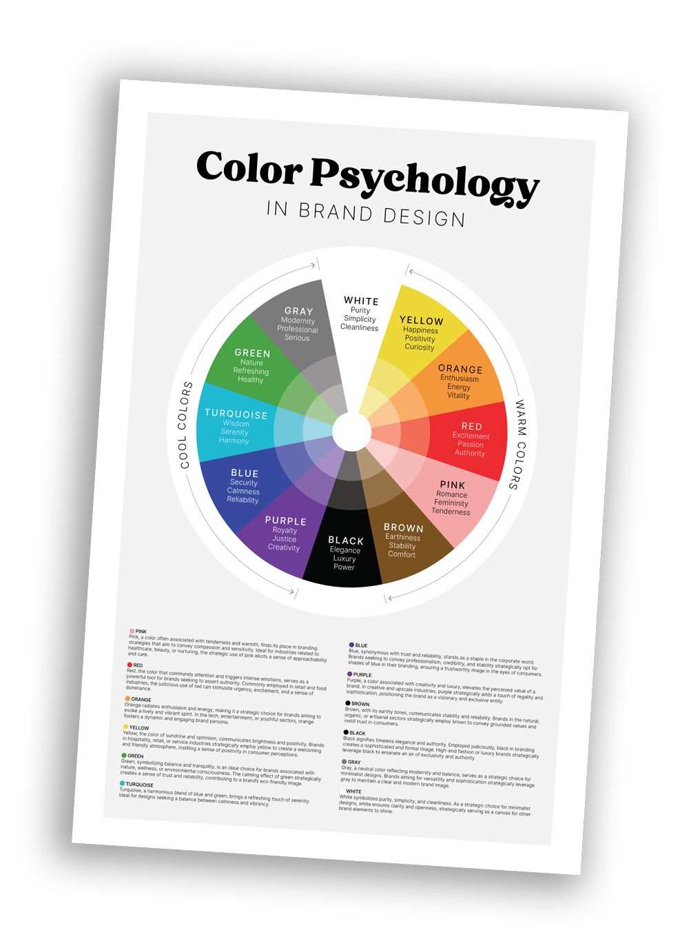
To fully appreciate the role of color in branding, it’s essential to understand the psychological and emotional associations that various colors carry. Here are some common colors and the emotions they typically evoke:
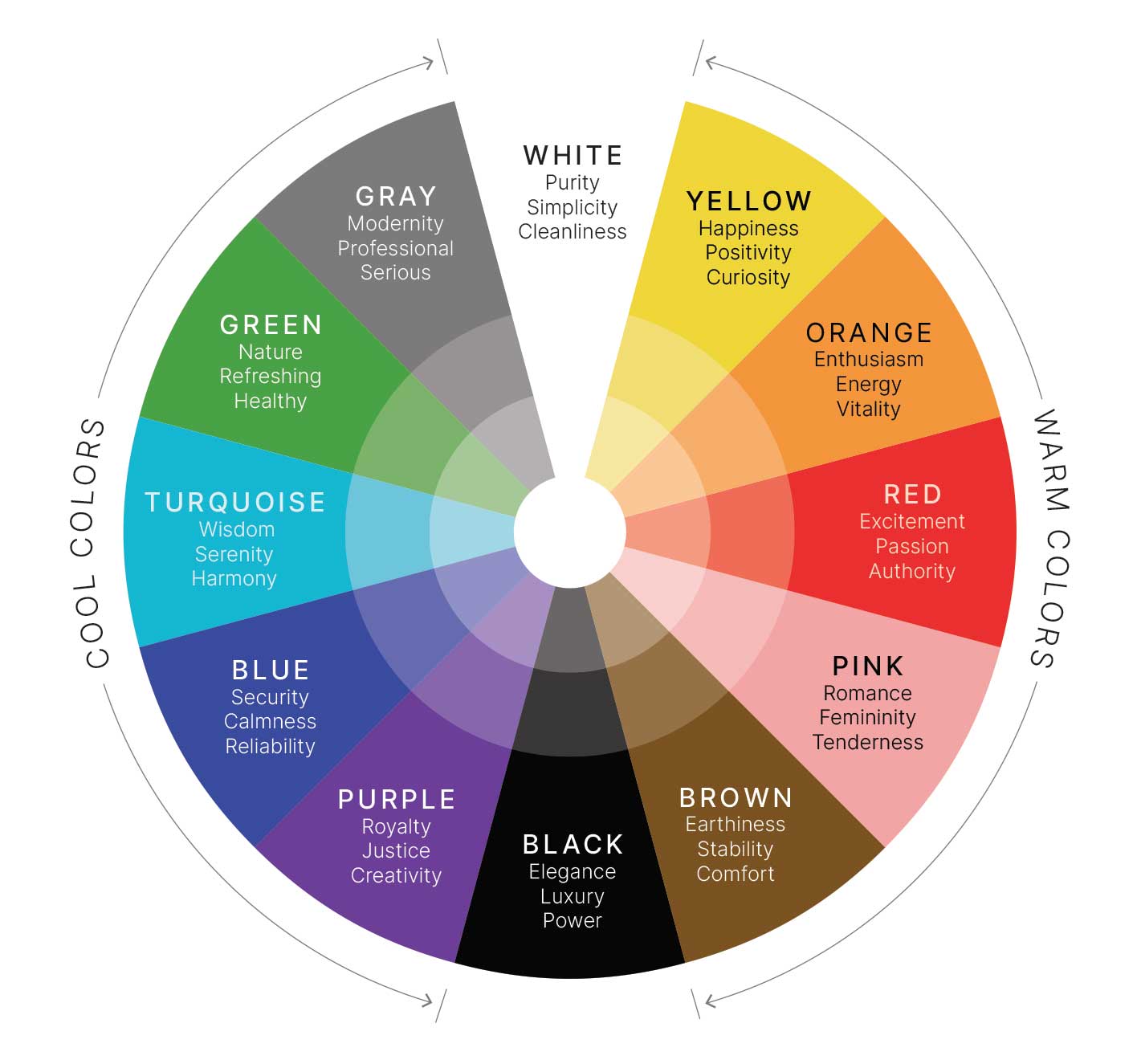
Pink
Pink, a color often associated with tenderness and warmth, finds its place in branding strategies that aim to convey compassion and sensitivity. Ideal for industries related to healthcare, beauty, or nurturing, the strategic use of pink elicits a sense of approachability and care.
Red
Red, the color that commands attention and triggers intense emotions, serves as a powerful tool for brands seeking to assert authority. Commonly employed in retail and food industries, the judicious use of red can stimulate urgency, excitement, and a sense of dominance.
Orange
Orange radiates enthusiasm and energy, making it a strategic choice for brands aiming to evoke a lively and vibrant spirit. In the tech, entertainment, or youthful sectors, orange fosters a dynamic and engaging brand persona.
Yellow
Yellow, the color of sunshine and optimism, communicates brightness and positivity. Brands in hospitality, retail, or service industries strategically employ yellow to create a welcoming and friendly atmosphere, instilling a sense of positivity in consumer perceptions.
Green
Green, symbolizing balance and tranquility, is an ideal choice for brands associated with nature, wellness, or environmental consciousness. The calming effect of green strategically creates a sense of trust and reliability, contributing to a brand’s eco-friendly image.
Turquoise
Turquoise, a harmonious blend of blue and green, brings a refreshing touch of serenity. Ideal for designs seeking a balance between calmness and vibrancy.
Blue
Blue, synonymous with trust and reliability, stands as a staple in the corporate world. Brands seeking to convey professionalism, credibility, and stability strategically opt for shades of blue in their branding, ensuring a trustworthy image in the eyes of consumers.
Purple
Purple, a color associated with creativity and luxury, elevates the perceived value of a brand. In creative and upscale industries, purple strategically adds a touch of regality and sophistication, positioning the brand as a visionary and exclusive entity.
Brown
Brown, with its earthy tones, communicates stability and reliability. Brands in the natural, organic, or artisanal sectors strategically employ brown to convey grounded values and instill trust in consumers.
Gray
Gray, a neutral color reflecting modernity and balance, serves as a strategic choice for minimalist designs. Brands aiming for versatility and sophistication strategically leverage gray to maintain a clear and modern brand image.
Black
Black signifies timeless elegance and authority. Employed judiciously, black in branding creates a sophisticated and formal image. High-end fashion or luxury brands strategically leverage black to emanate an air of exclusivity and authority.
White
White symbolizes purity, simplicity, and cleanliness. As a strategic choice for minimalist designs, white ensures clarity and openness, strategically serving as a canvas for other brand elements to shine.
The Utilization of Color Psychology in Crafting a Strategic Color Palette
Here are some tips to consider when discovering the perfect color palette for your business’ brand:
Case Studies in Effective Color Usage
To illustrate the power of color psychology in branding, let’s explore a few real-life case studies:
Coca-Cola - Red
 Coca-Cola’s iconic red color evokes excitement and passion, aligning perfectly with its brand’s image of happiness and celebration. The color red has become synonymous with Coca-Cola’s brand identity.
IBM - Blue
Starbucks - Green
McDonald's - Yellow and Red
Making Your Mark with Color
In the realm of branding, color is a potent tool that can shape perceptions, evoke emotions, and foster lasting impressions. By understanding the principles of color psychology and carefully selecting a color palette that aligns with a brand’s personality and goals, brand identities are created that leave a memorable and meaningful impact on audiences. Harnessing the psychological influence of color to craft compelling brand stories that resonate with people on a deep, emotional level is key to building trust and credibility with your target audience. Ultimately, the choice of colors in branding is not just about aesthetics; it’s about crafting an unforgettable brand experience.
"*" indicates required fields